> ## Documentation Index
> Fetch the complete documentation index at: https://flatfileinc-feat-updatereactquickstart.mintlify.site/llms.txt
> Use this file to discover all available pages before exploring further.

# Theme your Space

> Learn how to customize the look and feel of Flatfile to match your brand.

<Snippet file="shared/dxpbanner.mdx" />

Flatfile supports modifying most UI elements including colors, fonts, borders, padding, and
more via the <Tooltip tip="A micro-application...">[Space](../developer-tools/spaces)</Tooltip> endpoint.

1. Start by simply updating `theme.root.primaryColor` and `theme.sidebar.logo` when calling `spaces.update()`.
2. If needed, you can customize the theme further with additional css variables.

***

### Building a theme

Learn how to create a Space with a theme, and update a theme from an Event listener.

<Snippet file="guides/theming/block1.mdx" />

***

## Theme reference

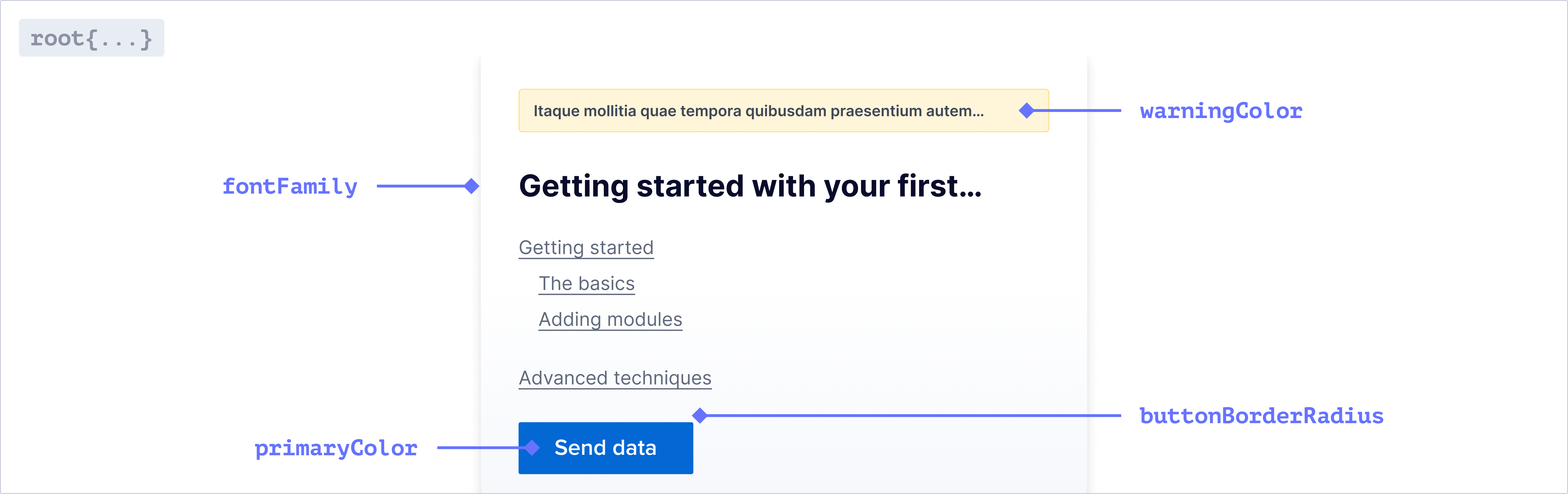
### `theme.root`
![theme.root](https://mintlify.s3-us-west-1.amazonaws.com/flatfileinc-feat-updatereactquickstart/images/customize/theme_root.png)

<Tip>
  The sidebar, table and document will automatically inherit theming from your
  root variables!
</Tip>

#### Font

<ParamField path="fontFamily" type="string">
  The font family used throughout the application. Only system fonts are
  supported at the moment
</ParamField>

#### Colors

<ParamField path="primaryColor" type="string">
  The primary color used throughout the application.
</ParamField>

<ParamField path="dangerColor" type="string">
  The color used for error messages.
</ParamField>

<ParamField path="warningColor" type="string">
  The color used for warning messages.
</ParamField>

<ParamField path="successColor" type="string">
  The color used for successful Actions.
</ParamField>

<ParamField path="actionColor" type="string">
  The color used for Action buttons and text. This will default to a slightly
  lighter shade of your primary color.
</ParamField>

<Info>
  For a more cohesive aesthetic, use the same color for your Action and Primary
  color.
</Info>

<ParamField path="borderColor" type="string">
  The color used for borders throughout the application.
</ParamField>

#### Buttons

<ParamField path="buttonBorderRadius" type="string">
  The border radius for all standard buttons.
</ParamField>

#### Badges

<ParamField path="badgeBorderColor" type="string">
  The border color for all badges.
</ParamField>

<ParamField path="badgeBorderRadius" type="string">
  The border radius for all badges.
</ParamField>

#### Checkboxes

<ParamField path="checkboxBorderColor" type="string">
  The border color for all checkboxes.
</ParamField>

<ParamField path="checkboxBorderRadius" type="string">
  The border radius for all checkboxes.
</ParamField>

#### Dropdowns, Text Inputs, and Context Menus

<ParamField path="interactiveBorderColor" type="string">
  The border color for all dropdowns, text inputs, and context menus.
</ParamField>

<ParamField path="interactiveBorderRadius" type="string">
  The border radius for all dropdowns, text inputs, and context menus.
</ParamField>

#### Tabstrip

<ParamField path="tabstripActiveColor" type="string">
  The color for active tabs in a tabstrip.
</ParamField>

<ParamField path="tabstripInactiveColor" type="string">
  The color for inactive tabs in a tabstrip.
</ParamField>

<ParamField path="tabstripHoverTextColor" type="string">
  The text color for tabs in a tabstrip on hover.
</ParamField>

<ParamField path="tabstripHoverBorderColor" type="string">
  The border color for tabs in a tabstrip on hover.
</ParamField>

#### Modals

<ParamField path="modalBorderRadius" type="string">
  The border radius for modals.
</ParamField>

#### Pills

<ParamField path="pillBorderRadius" type="string">
  The border radius for all pills.
</ParamField>

#### Popovers

<ParamField path="popoverBackgroundColor" type="string">
  The background color for popovers.
</ParamField>

<ParamField path="popoverBorderRadius" type="string">
  The border radius for popovers.
</ParamField>

#### Tooltips

<ParamField path="tooltipBackgroundColor" type="string">
  The background color for tooltips.
</ParamField>

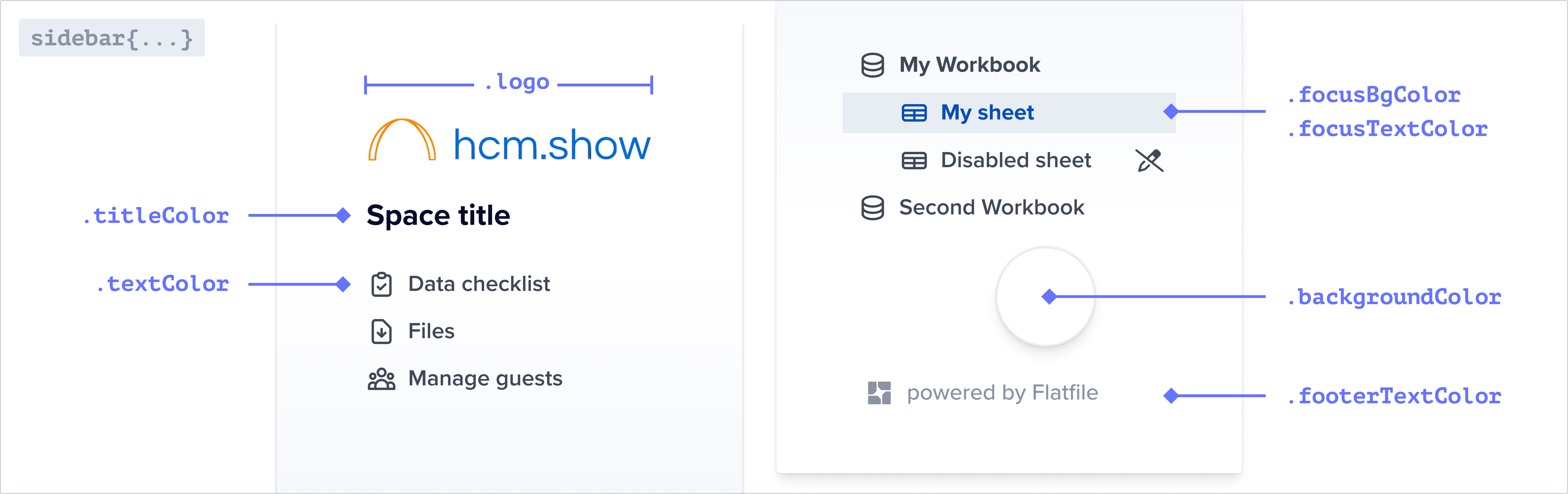
### `theme.sidebar`

![theme.sidebar](https://mintlify.s3-us-west-1.amazonaws.com/flatfileinc-feat-updatereactquickstart/images/customize/theme_sidebar.png)

<Info>
  You can override the default colors of the sidebar below. If these are not set
  they will inherit from your root colors.
</Info>

<ParamField path="logo" type="string">
  The img path for the logo displayed in the sidebar.
</ParamField>

<ParamField path="textColor" type="string">
  The color of the text in the sidebar.
</ParamField>

<ParamField path="titleColor" type="string">
  The color of the title in the sidebar.
</ParamField>

<ParamField path="focusBgColor" type="string">
  The background color of the active navigation link. The hover state will use
  the same color with 30% opacity applied.
</ParamField>

<ParamField path="focusTextColor" type="string">
  The text color of the active/focused navigation link.
</ParamField>

<ParamField path="backgroundColor" type="string">
  The background color of the sidebar.
</ParamField>

<ParamField path="footerTextColor" type="string">
  The text color of the footer in the sidebar.
</ParamField>

<ParamField path="borderColor" type="string">
  The color of horizontal lines between sections in the navigation.
</ParamField>

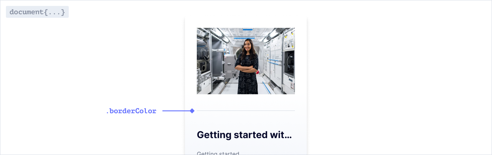
### `theme.document`

![theme.document](https://mintlify.s3-us-west-1.amazonaws.com/flatfileinc-feat-updatereactquickstart/images/customize/theme_document.png)

<ParamField path="borderColor" type="string">
  The color of horizontal rules in Documents.
</ParamField>

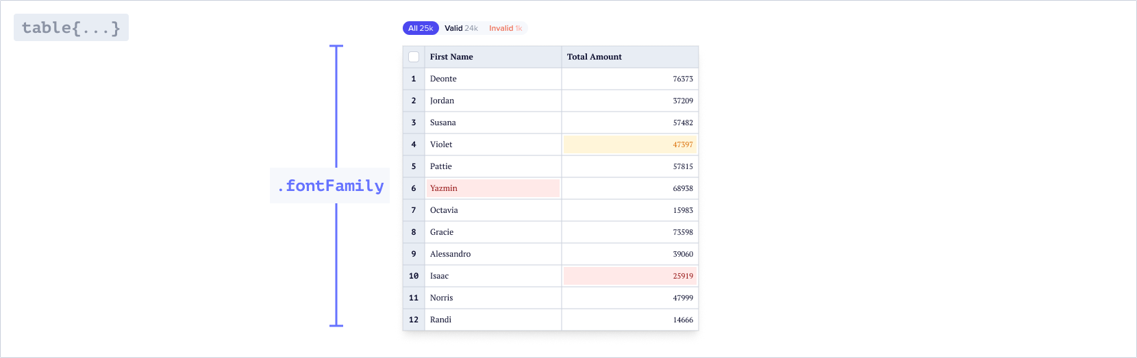
### `theme.table`

![theme.table](https://mintlify.s3-us-west-1.amazonaws.com/flatfileinc-feat-updatereactquickstart/images/customize/theme_table.png)

<Info>
  You can override the default colors and values for different elements in the
  table below. If these are not set they will inherit from your root values.
</Info>

#### Font

<ParamField path="fontFamily" type="string">
  The font family used throughout the table. Only system fonts are supported at
  the moment
</ParamField>

#### Active cell

##### `theme.table.cell`

<br />

<ParamField path="cell.active.borderWidth" type="string">
  The width of the border around the active cell.
</ParamField>

<ParamField path="cell.active.borderShadow" type="string">
  The box shadow around the active cell.
</ParamField>

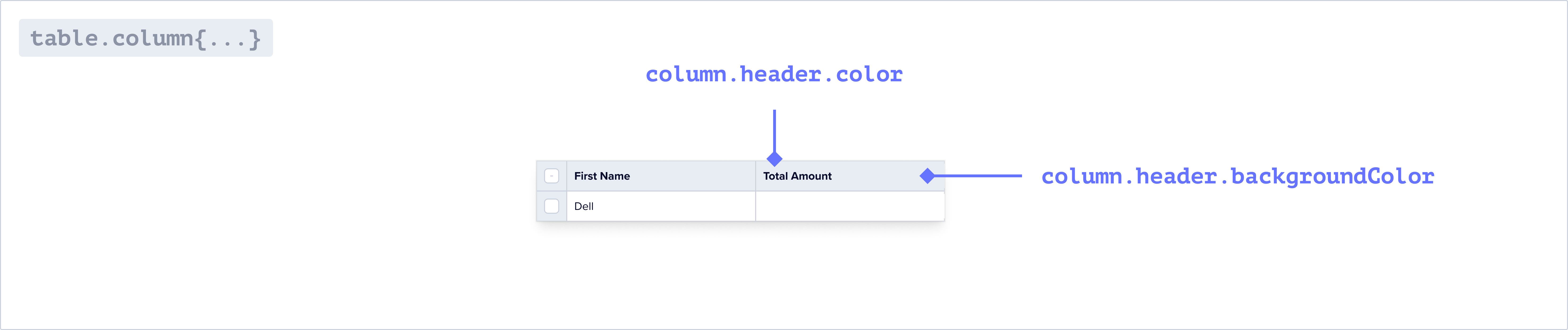
#### Column header

##### `theme.table.column`
![theme.table.column](https://mintlify.s3-us-west-1.amazonaws.com/flatfileinc-feat-updatereactquickstart/images/customize/theme_table_column.png)

<ParamField path="column.header.backgroundColor" type="string">
  The background color of the column headers in the table.
</ParamField>

<ParamField path="column.header.color" type="string">
  The text color of the column headers in the table.
</ParamField>

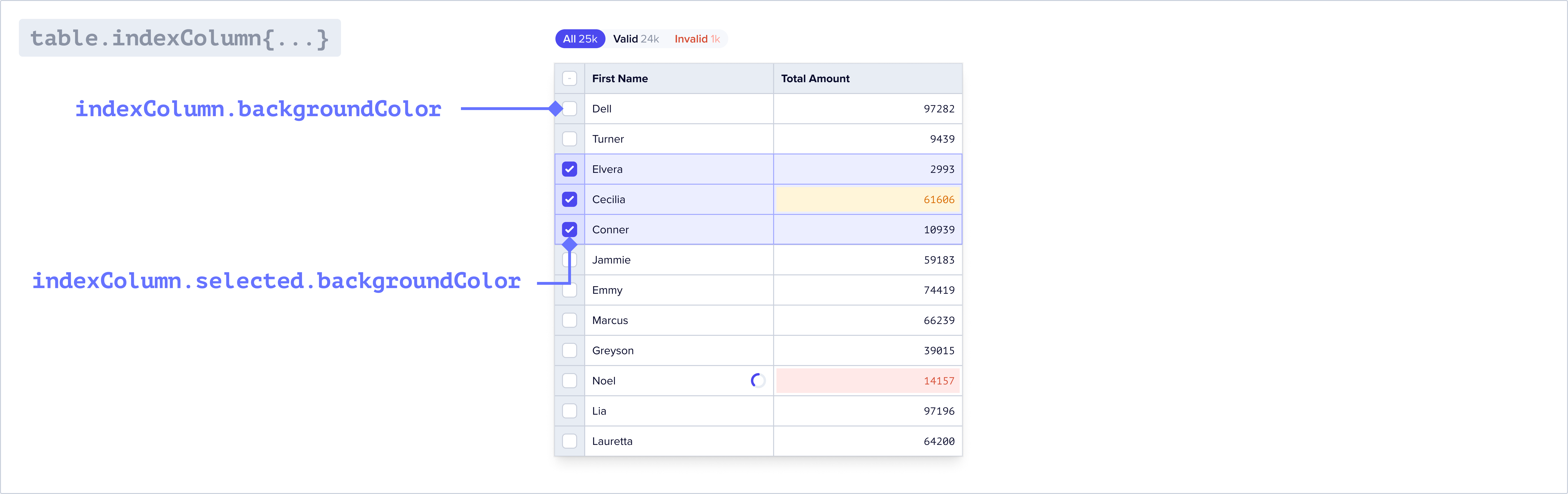
#### Index column

##### `theme.table.indexColumn`
![theme.table.indexColumn](https://mintlify.s3-us-west-1.amazonaws.com/flatfileinc-feat-updatereactquickstart/images/customize/theme_table_indexColumn.png)

<ParamField path="indexColumn.backgroundColor" type="string">
  The background color of the first column in the table.
</ParamField>

<ParamField path="indexColumn.color" type="string">
  The text color of the first column in the table.
</ParamField>

<ParamField path="indexColumn.selected.backgroundColor" type="string">
  The background color of the first column in the table when selected.
</ParamField>

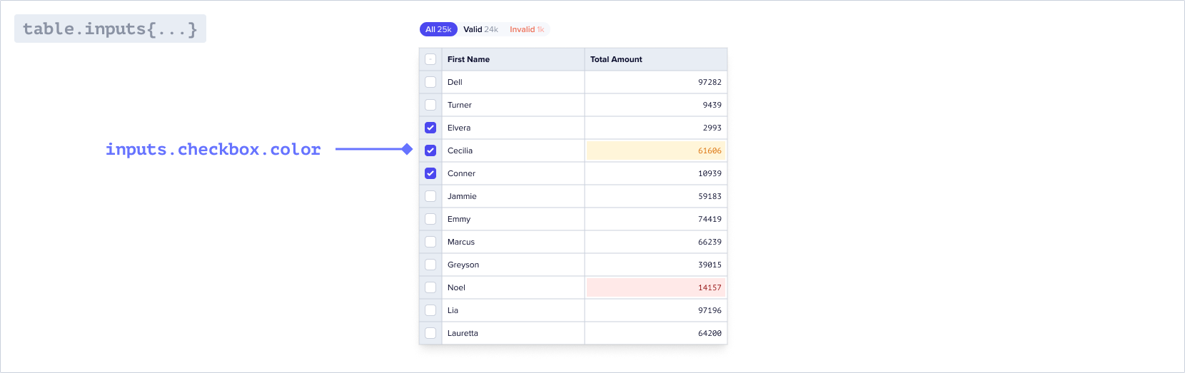
#### Checkboxes

##### `theme.table.inputs`
![theme.table.inputs](https://mintlify.s3-us-west-1.amazonaws.com/flatfileinc-feat-updatereactquickstart/images/customize/theme_table_inputs.png)

<ParamField path="inputs.checkbox.color" type="string">
  The color of the checkboxes in the table.
</ParamField>

<ParamField path="inputs.checkbox.borderColor" type="string">
  The color of the border for the checkboxes in the table.
</ParamField>

#### Filters

##### `theme.table.filters`

<br />

<ParamField path="filters.outerBorderRadius" type="string">
  The border radius of the table filters
</ParamField>

<ParamField path="filters.innerBorderRadius" type="string">
  The border radius for the individual filters
</ParamField>

<ParamField path="filters.outerBorder" type="string">
  The border of the table filters. By default there is no border.
</ParamField>

<Info>
  When nested objects share the same border radius, small gaps may appear. To
  resolve this, adjust the inner and outer border radius on the filters to
  seamlessly fill any gaps.
</Info>

#### Buttons

##### `theme.table.buttons`

<br />

<ParamField path="buttons.iconColor" type="string">
  The color of the icon buttons in the toolbar and table
</ParamField>

<ParamField path="buttons.pill.color" type="string">
  The color of the pill buttons in the toolbar
</ParamField>

<ParamField path="filters.pill.backgroundColor" type="string">
  The background color of the pill buttons in the toolbar
</ParamField>

### `theme.email`

You can theme the guest invite emails as well as guest email verification emails via the properties below. These are sent to a guest when they are invited to a Space via the guest management page in your Space.

<Info>
  Email theming is only available on the pro and enterprise plans.
</Info>

<ParamField path="logo" type="string">
  The URL of the image displayed at the top of the email
</ParamField>

<ParamField path="textColor" type="string">
  The color of the text in the email
</ParamField>

<ParamField path="titleColor" type="string">
  The color of the title in the email
</ParamField>

<ParamField path="buttonBgColor" type="string">
  The background color of the button
</ParamField>

<ParamField path="buttonTextColor" type="string">
  The text color of the button
</ParamField>

<ParamField path="footerTextColor" type="string">
  The text color of the footer text
</ParamField>

<ParamField path="backgroundColor" type="string">
  The background color of the email
</ParamField>

## Example Project

Find the theming example in the Flatfile GitHub repository.

<CardGroup cols={2}>
  <Card title="typescript" icon="code-merge" href="https://github.com/FlatFilers/flatfile-docs-kitchen-sink/blob/main/typescript/theming/index.ts">
    Clone the theming example in Typescript
  </Card>

  <Card title="javascript" icon="js" href="https://github.com/FlatFilers/flatfile-docs-kitchen-sink/blob/main/javascript/theming/index.js">
    Clone the theming example in Javascript
  </Card>
</CardGroup>