- Start by simply updating
theme.root.primaryColorandtheme.sidebar.logowhen callingspaces.update(). - If needed, you can customize the theme further with additional css variables.
Building a theme
Learn how to create a Space with a theme, and update a theme from an Event listener.Theme reference
theme.root
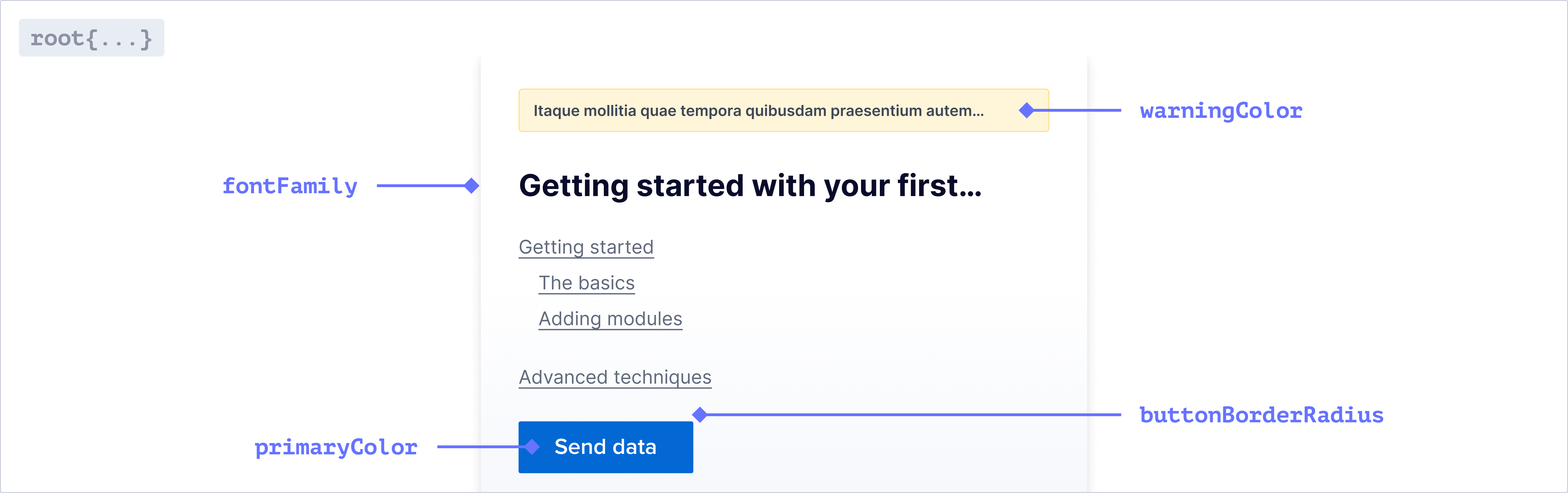
Font
string
The font family used throughout the application. Only system fonts are
supported at the moment
Colors
string
The primary color used throughout the application.
string
The color used for error messages.
string
The color used for warning messages.
string
The color used for successful Actions.
string
The color used for Action buttons and text. This will default to a slightly
lighter shade of your primary color.
For a more cohesive aesthetic, use the same color for your Action and Primary
color.
string
The color used for borders throughout the application.
Buttons
string
The border radius for all standard buttons.
Badges
string
The border color for all badges.
string
The border radius for all badges.
Checkboxes
string
The border color for all checkboxes.
string
The border radius for all checkboxes.
Dropdowns, Text Inputs, and Context Menus
string
The border color for all dropdowns, text inputs, and context menus.
string
The border radius for all dropdowns, text inputs, and context menus.
Tabstrip
string
The color for active tabs in a tabstrip.
string
The color for inactive tabs in a tabstrip.
string
The text color for tabs in a tabstrip on hover.
string
The border color for tabs in a tabstrip on hover.
Modals
string
The border radius for modals.
Pills
string
The border radius for all pills.
Popovers
string
The background color for popovers.
string
The border radius for popovers.
Tooltips
string
The background color for tooltips.
theme.sidebar
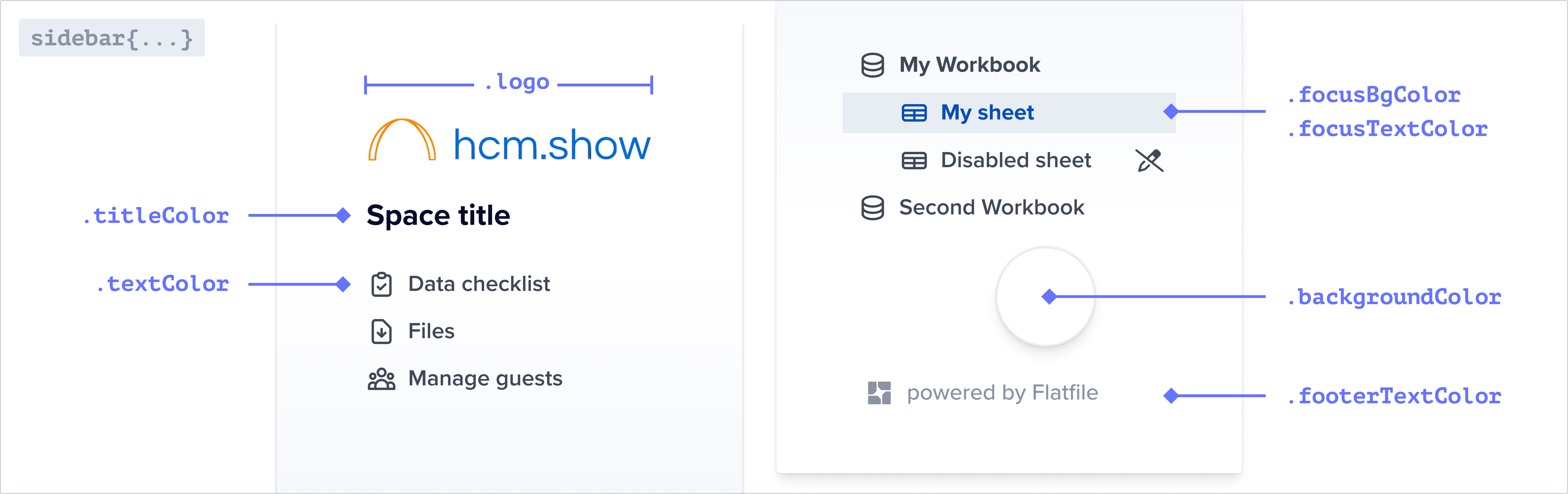
You can override the default colors of the sidebar below. If these are not set
they will inherit from your root colors.
string
The img path for the logo displayed in the sidebar.
string
The color of the text in the sidebar.
string
The color of the title in the sidebar.
string
The background color of the active navigation link. The hover state will use
the same color with 30% opacity applied.
string
The text color of the active/focused navigation link.
string
The background color of the sidebar.
The text color of the footer in the sidebar.
string
The color of horizontal lines between sections in the navigation.
theme.document
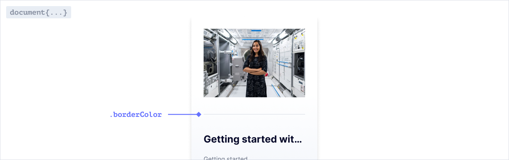
string
The color of horizontal rules in Documents.
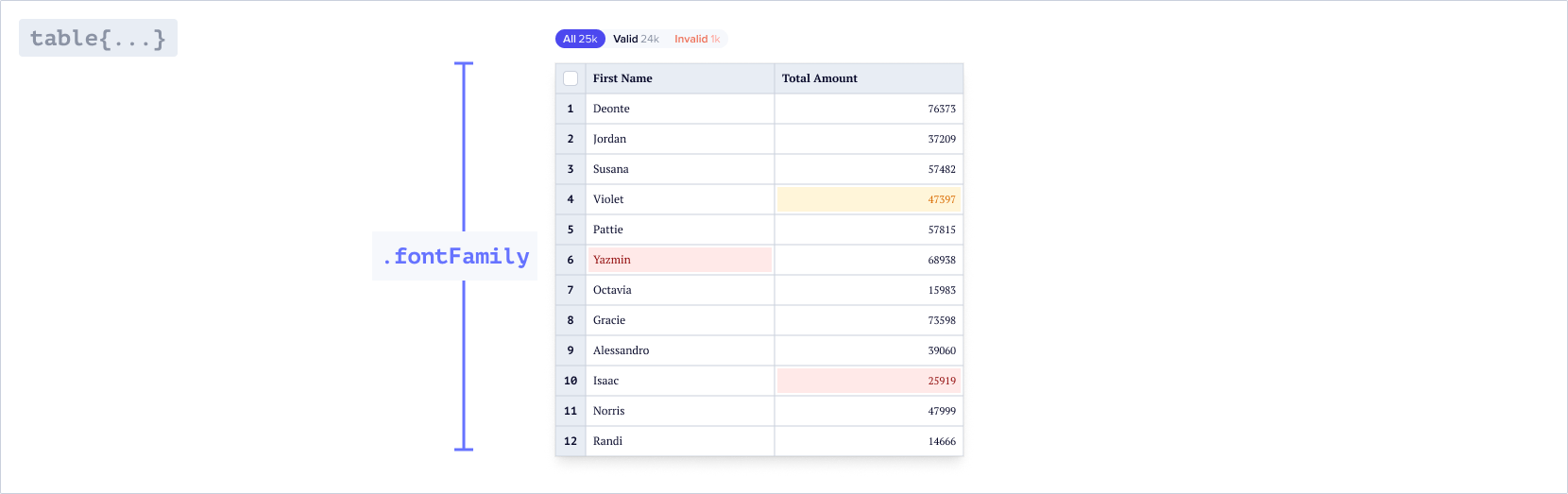
theme.table
You can override the default colors and values for different elements in the
table below. If these are not set they will inherit from your root values.
Font
string
The font family used throughout the table. Only system fonts are supported at
the moment
Active cell
theme.table.cell
string
The width of the border around the active cell.
string
The box shadow around the active cell.
Column header
theme.table.column
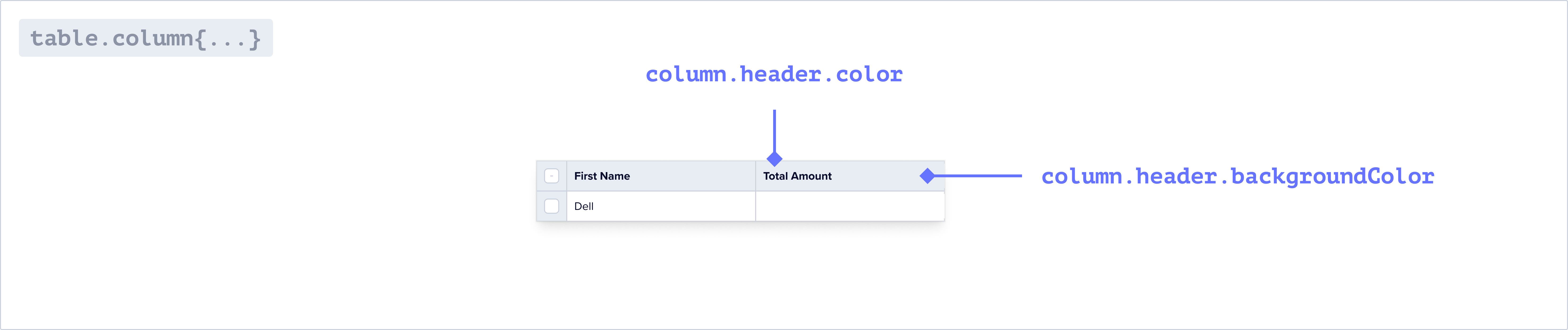
string
The background color of the column headers in the table.
string
The text color of the column headers in the table.
Index column
theme.table.indexColumn
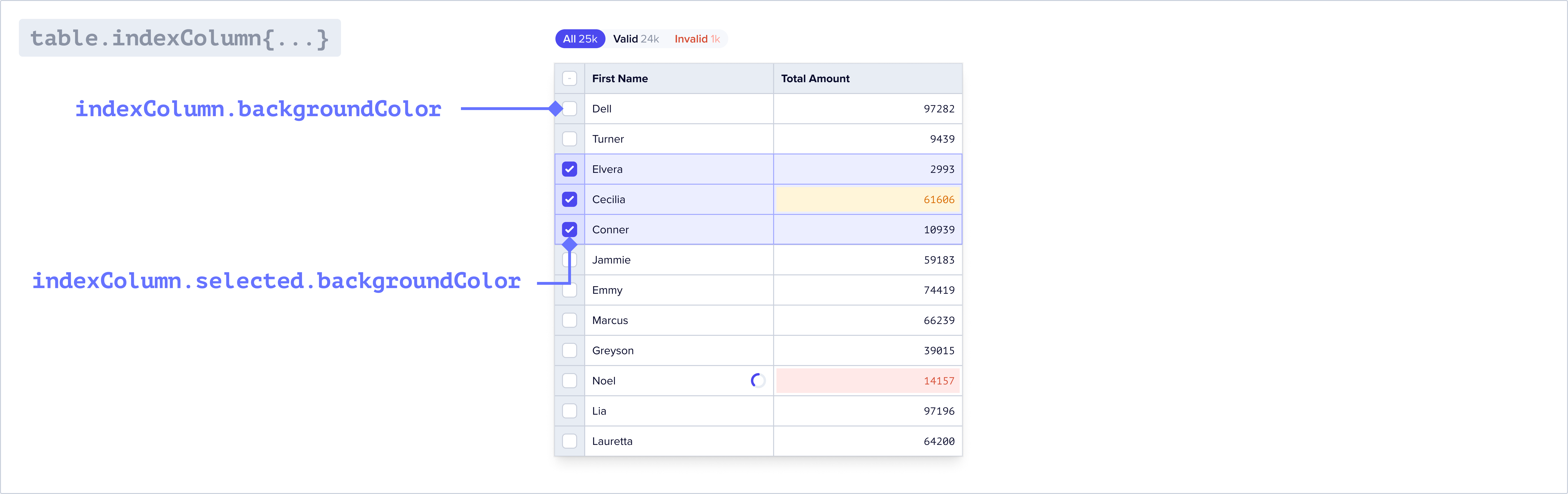
string
The background color of the first column in the table.
string
The text color of the first column in the table.
string
The background color of the first column in the table when selected.
Checkboxes
theme.table.inputs
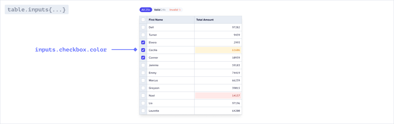
string
The color of the checkboxes in the table.
string
The color of the border for the checkboxes in the table.
Filters
theme.table.filters
string
The border radius of the table filters
string
The border radius for the individual filters
string
The border of the table filters. By default there is no border.
When nested objects share the same border radius, small gaps may appear. To
resolve this, adjust the inner and outer border radius on the filters to
seamlessly fill any gaps.
Buttons
theme.table.buttons
string
The color of the icon buttons in the toolbar and table
string
The color of the pill buttons in the toolbar
string
The background color of the pill buttons in the toolbar
theme.email
You can theme the guest invite emails as well as guest email verification emails via the properties below. These are sent to a guest when they are invited to a Space via the guest management page in your Space.
Email theming is only available on the pro and enterprise plans.
string
The URL of the image displayed at the top of the email
string
The color of the text in the email
string
The color of the title in the email
string
The background color of the button
string
The text color of the button
The text color of the footer text
string
The background color of the email
Example Project
Find the theming example in the Flatfile GitHub repository.typescript
Clone the theming example in Typescript
javascript
Clone the theming example in Javascript